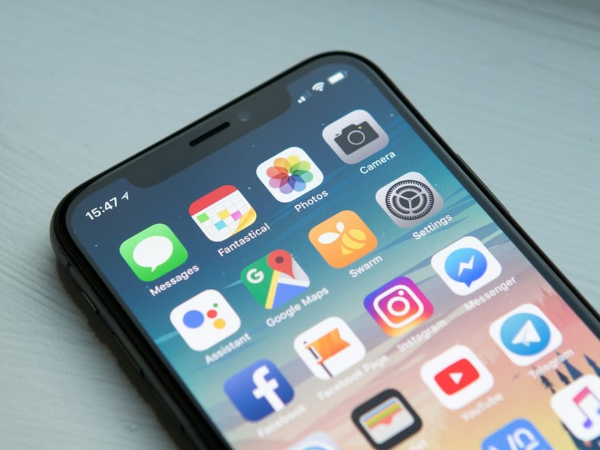
Starting with the smallest screen forces clarity: one task per view, the most important thing first, controls within thumb reach. Those constraints improve the large-screen version too.
But mobile first is a starting point. Tablets, laptops and wide monitors each deserve a layout that uses the extra space well rather than stretching a phone design across it.
Test on real devices and on slow connections. The gap between a simulator and a mid-range phone on a busy network is where most of the surprises live.
